22 Bishopsgate is big, as large as a container ship perched on its end. At an all-inclusive total of just over 195,000 sq metres, it’s probably the largest office building ever built in Britain. At 278 metres high – or 62 storeys – it comes second only to the 310-metre Shard as the tallest building in the country. Which raises two questions. Is there such a thing as too big when it comes to such buildings? And is so much space needed at a time when remote working and the altered habits of the pandemic might conceivably reduce the demand for conventional office space?
The project, which stands in the City of London, has been developed by Lipton Rogers Developments on behalf of the investment managers Axa and an international consortium of investors. Stuart Lipton, one of Lipton Rogers’ founders, believes that 22 Bishopsgate happily meets the demands and desires of a world that has changed in ways that no one predicted. So far it is 60% let, to businesses such as the US law firms Cooley and Covington & Burling and the insurance companies Hiscox and Beazley, with more tenants “on the way”.
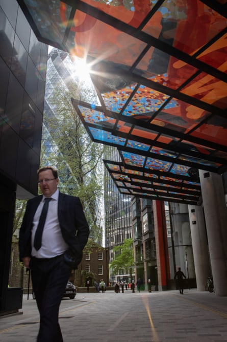
 View image in fullscreen‘Colourful and splashy’: 22 Bishopsgate’s art-covered glass canopy at street level. Photograph: Andy Hall/the Observer
Lipton calls it a “vertical village”, designed to make work sociable and pleasurable. “An office building should be lively,” he says. “We’re all social animals … people want to experience life.” He believes that, in the world of office design, Covid-19 provides an occasion to realise that “everyone had got stuck”. From now on, is the idea, businesses will have to work harder to attract people into the office. A former trend towards smaller desk spaces will be reversed. Employees might come in slightly less often, but when they do they will be offered a better experience: less battery-farmed, more free-range.
So 22 Bishopsgate, which is designed by Karen Cook of the architects PLP, has art, colourful and splashy, in the triple-decker entrance lobby and the high-speed double-decker lifts, built into the glass canopies that overhang the pavement and an “art street” running down one side. Some of it is permanent, some part of a changing display. The building is also dedicated to “wellness”, which means it has a 41st floor “retreat” and a glass climbing wall on the 25th floor, so you can practice your skills with panoramas of London vertiginously spread before you. There are bike parks and showers in the basement, a “club” on the 57th floor, and “the Market” on the second floor, which is an extensive area of coffee shops and bars and “changing street-food style stalls”.
The public will, with a bit of caution, be invited in. There is a viewing gallery at the top of the building which, unlike the £25-a-pop version in the Shard, will be free to enter – and, unlike the Walkie-Talkie’s “sky garden”, will not be colonised by an expensive bar. The outlets in the Market will be open to the public at some times of day, though to what extent will be decided once the demand from 12,000 workers inside the building has become clear. The entrance area is intended to be open and welcoming, with curated soundtracks, “signature scent” and accessible, dressed-down staff. It presents a long glass wall to the street, and can be freely entered until you get to the security barriers through which the office floors are reached.
By straining to maximise every cubic metre, it threatens to crush its own good intentions
For Lipton, all this is a continuation of the developments he has been doing since the 1980s: an office campus called Chiswick Park, in west London, and the Broadgate development near Liverpool Street station, which included an ice rink among its attractions. It combines what he has long called “quality architecture” – glass walls designed to maximise natural light, higher than usual ceiling heights – with the elements designed to enhance the lives of workers. It is rated “excellent” under the BREEAM assessment of the sustainability of buildings, and although its construction will have used plenty of energy-intensive steel and concrete, Lipton is proud to have re-used concrete piles from a previous construction on the site.
22 Bishopsgate is also a version of the fun-and-games facilities with which the tech giants of Silicon Valley attract valued employees, albeit adjusted to the more sober tastes of the City of London. I’ve heard the phrase “vertical village” before, with reference to the Shard and to the 230-metre Salesforce Tower (formerly the Heron Tower), which is just along Bishopsgate from number 22, and I would question the extent to which an office block can be village-like or a village be vertical. A lift is not a lane, and villages tend to grow over time out of a multiplicity of tenures and uses, not from the decisions of a single property consortium. There’s a limit to how market-like the Market can be: it is inevitably a highly managed environment.
 View image in fullscreen‘A social zone first and an office lobby second’: the ground floor reception of 22 Bishopsgate. Photograph: Andy Hall/the Observer
But never mind. There’s plenty to like about the idea of enriching office workers’ lives, and 22 Bishopsgate does more in this respect than other speculative City office blocks. Mostly you want more of it: if the inner life of the building drives the design, then it would be good to see it break out. Terraces and balconies and porticoes could become the most significant parts of the architecture, rather than the somewhat inscrutable glass cladding that wraps it. The entrance would be a social zone first and an office lobby second. At present, dominated by escalators and curiously short of seating, it doesn’t fully achieve this.
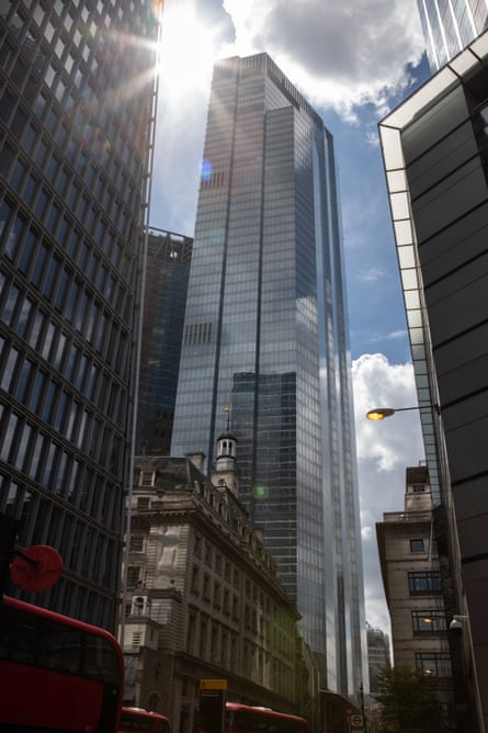
Its villagey-ness is also at odds with its size. 22 Bishopsgate is on a suitable site for a tall and large building, but by straining to maximise every cubic metre, it threatens to crush its own good intentions. A less bulky building would allow more give and take between itself and its surroundings, and would be less overbearing to its neighbours and on the skyline. Karen Cook has done her best to sculpt and flute its form, so that, from some directions, it looks almost graceful, but from others there’s no disguising its vastness.
 View image in fullscreenA relatively dignified form: 22 Bishopsgate. Photograph: Andy Hall/the Observer
Its scale is partly to do with the history of the site: there was a previous proposal here, for a swoopy, glassy thing called the Pinnacle, also named the Helter Skelter by an Evening Standard headline writer, conceived at the height of the mid-00s love of iconic architecture. It proved too fanciful to survive the 2008 crash; eventually construction stuttered to a halt, leaving the concrete stump of a lift core that was embarrassing to the City’s image as a world financial centre. So Lipton’s proposal to solve their problem, made viable by colossal amounts of floorspace, proved attractive.
This is a story typical of London planning, whereby a series of pitches and false starts, costing years, or even decades, of lost time and many millions in consultants’ fees, end up with a compromise between the needs of business and those of the urban fabric. The project gets bigger and bigger, in part to pay for all the costs sunk into the bizarrely inefficient process. It would surely be better all round if there were a clear and strong statement at the outset as to what would work best for the surrounding city, and less haggling as to what that might be.
There is much that’s good about 22 Bishopsgate, and it was created by serious people. Its relatively dignified form is preferable to the frenzy of wonky would-be icons that surround it, and its high entrance hall is more appealing than that of most of its competitors. But it’s hard to be a container ship and a village at the same time.


